
Allegiant Air - Ad Hoc Overhaul & Survey Health Platform
Redesigning ad hoc surveying and implementing data visualization with health performance monitoring.
Project Overview
This project encompasses two parts: a visual overhaul of our ad hoc surveying and a Survey Health Platform.
The visual redesign of Allegiant’s ad hoc surveying platform was one of my first big project sprints. The project prioritized visual redevelopment of our ad hoc surveys sent from Conjointly. These surveys are sent fast and sporadically across all 26 million customers and Allegiant employees, with the premise being a fast method to gather qualitative data. Before my redesign the surveys lacked any sort of branding, relying on proprietary templates. As a result of my redesign, completion rates jumped almost 80% in select cases, and an overall boost in time-to-complete was also observed.
The second sprint involved the survey health platform. A passion project, the platform tracks the performance of ad hoc surveys we distribute. From simple metrics such as respondent count or survey type, to advanced monitoring of survey status and CSAT, the health platform provides us with a comprehensive summary of survey performance. This tool was built as a supplementary piece to my ad hoc survey overhaul, in order to keep track of monitoring performance and identify any outliers or areas of improvement.
Project Outcomes and Impact
Both projects act in unison, to improve visual clarity and design to those taking the survey, while providing data visualization and easy reporting to internal teams processing the data. The ad hoc survey redesign sees continued use today, where teams can now get quick answers directly from customers with improved accessibility and functionality. The health platform saw similar uplift, allowing distribution of survey performance and health monitoring to a broader audience of managers and VPs. The platform also helps visualize the survey pipeline, notably active vs completed surveys. Visuals and screenshots below contain a simplified version of the platform including the use of dummy data for reference, noting the final implementation contains nuanced differences, though works and functions similarly.
Collaborators
Dev/Designer: Ralph C.
QA: Blake E.
Timeline
Ad Hoc Redesign
Nov 2025 - Dec 2025
Health Platform
Aug 2025 - Mar 2026
Tools
Figma
Conjointly
CSS/HTML
Initial Challenges
The legacy platform had several inconsistencies, but for brevity-sake I took the liberty of pinpointing 3 core problems involving data quality and user engagement:
Visual Ineffectiveness: The original interface relied on plain text links and minimal styling, creating an unfocused UX with no visual hierarchy.
Surveys felt disconnected from each other, and there was no sense of unity or conformity around a central brand
Data gathered often went unused, and with no product owner insights that were collected didn’t translate into actionable decision-making for business teams
Rather than temporary improvements, I approached the redesign through the lens of 3 primary objectives:
Establish clear visual hierarchy to guide users, transforming response options into interactive elements while weaving Allegiant's brand language throughout the digital experience
Reinforce brand identity through proper branding, including team-specific logos in the header and a friendly yet simple footer
Enhance interaction design through careful use of bold colors, clearly differentiating answer choices and acknowledging which options users already clicked
Design Goals: Three Core Focuses
The work revealed several constraints worth solving for: surveys had varying numbers of response options that needed to scale gracefully, certain responses needed emphasis without creating confusion, mobile users needed adequate touch targets, and all improvements had to maintain accessibility standards.
Key Challenges: 5 Core Constraints
Design Inspirations
The first step was to observe similar surveys issued by companies. I chose Wingstop and Panda Express, oddly enough because the only customized surveys I could find were from food brands. Other companies in tech, transportation, or retail all had similar surveys with minimal customization. This presents an opportunity to set ourselves apart from the competition. Furthermore, the nature of fast results through ad hoc analytics exhibits similar characteristics to post-meal surveying, gathering customer insights in-the-moment. Plus I got free wings and discounted takeout from both respectively, so a win is a win!
The process followed a clear arc, analyzing the original survey flows and identifying pain points, designing a cohesive component system aligned with brand guidelines, and implementing responsive functionality while evaluating improvements through user testing. At this stage I met with several business leaders to discuss design changes, including current of future concerns with regard to program development.
I also took liberty to begin designing, where I’ve attached a few prototypes below. Even though they’re beautiful in their own ways, each iteration focused on a separate issue regarding spacing and padding, hierarchy, flow, and overall visual development.
Solution Approach: Redesign Methodology
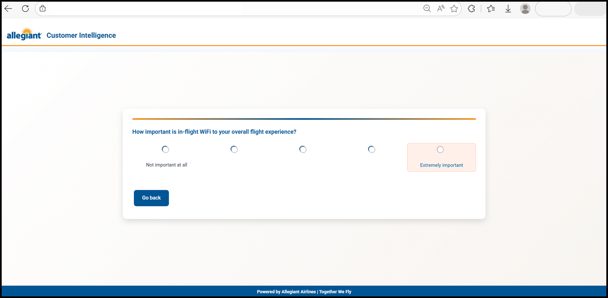
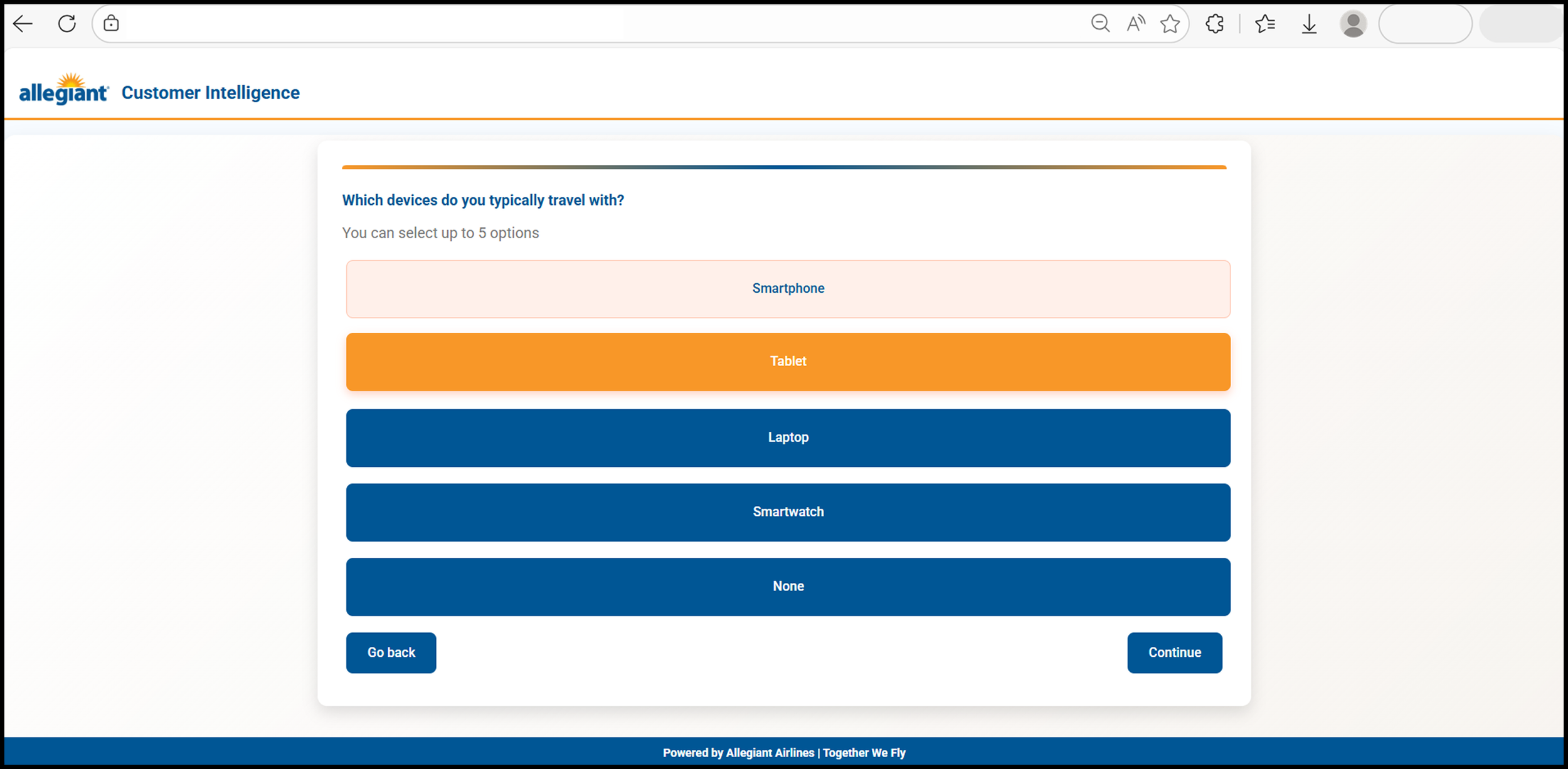
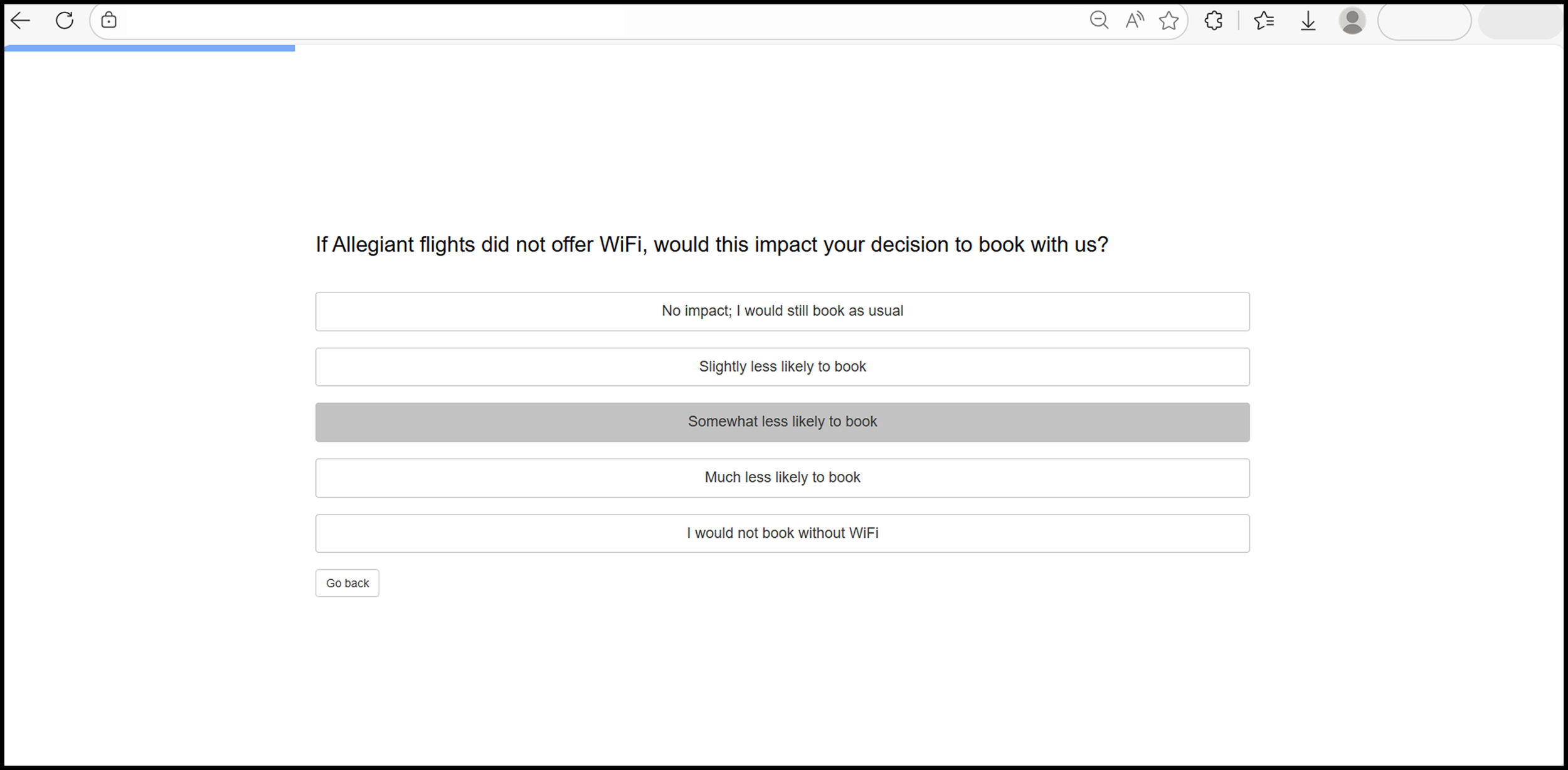
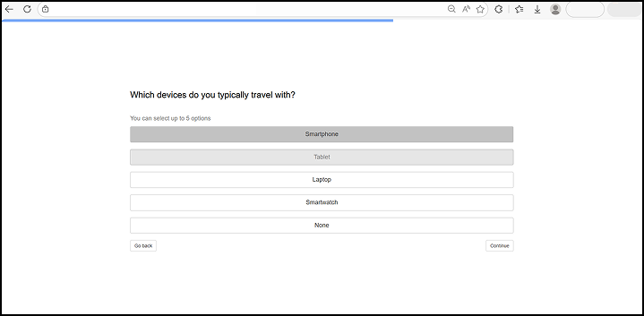
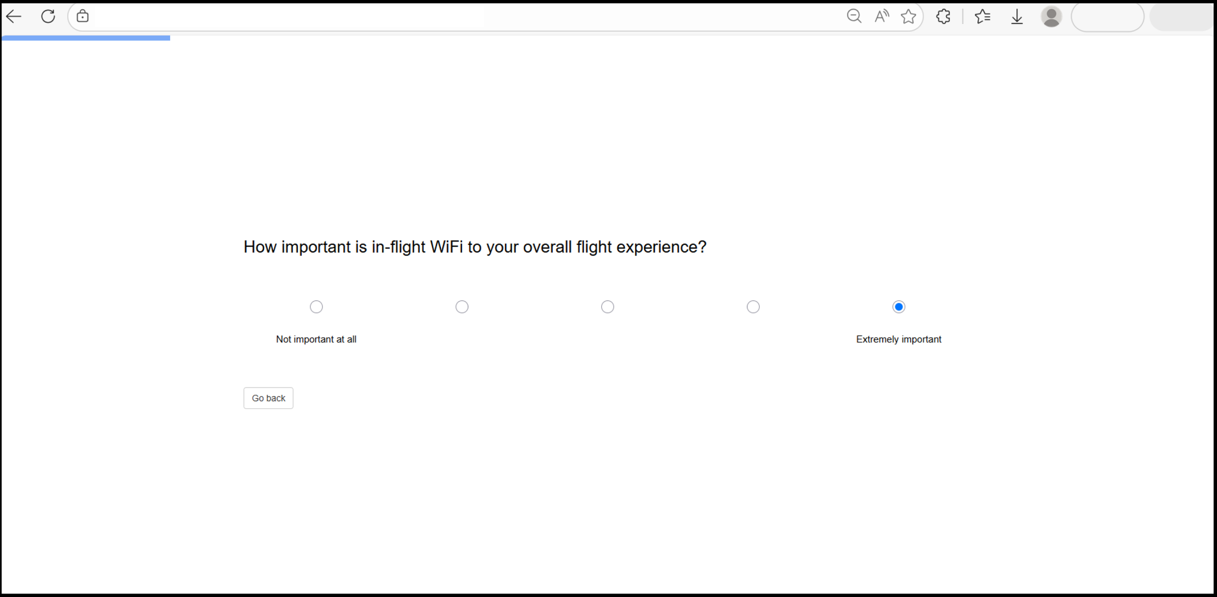
Through the interviews and prototype development, I was able to land on a final design of the survey, which combined the best attributes from all tests and created a simple interface that wasn’t too overpowering. The design emphasized clear distinctions between interactable elements of the survey, and used Allegiant’s high-contrast orange and blue colors to distinguish between alternating elements in each question, with the survey adjusting the design depending on question type. Below is a sample of the before and after, followed by a gallery showing more examples.
Final Design: Before and After


After the redesign
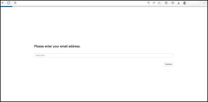
Before the redesign

Survey Health Platform
I used the ad hoc redesign to spearhead my development of the survey platform. Because this was a passion project, I used Claude to significantly speed up development time. I used the end result from the ad hoc survey as a baseline reference, but there were a few challenges that I faced with this design.
Key Challenges
Platform would have to be hard-coded, no use of proprietary software
Dashboard would depend on ingesting an Excel file, that should only have key details about survey health and performance
Use of GenAI and “Vibecoding” subject to artifacts, unintended design changes, and on-the-fly changes could be cumbersome depending on script length
Despite these changes I decided to try it.

Final Concept Render for the Survey Health Platform
Initial Challenges
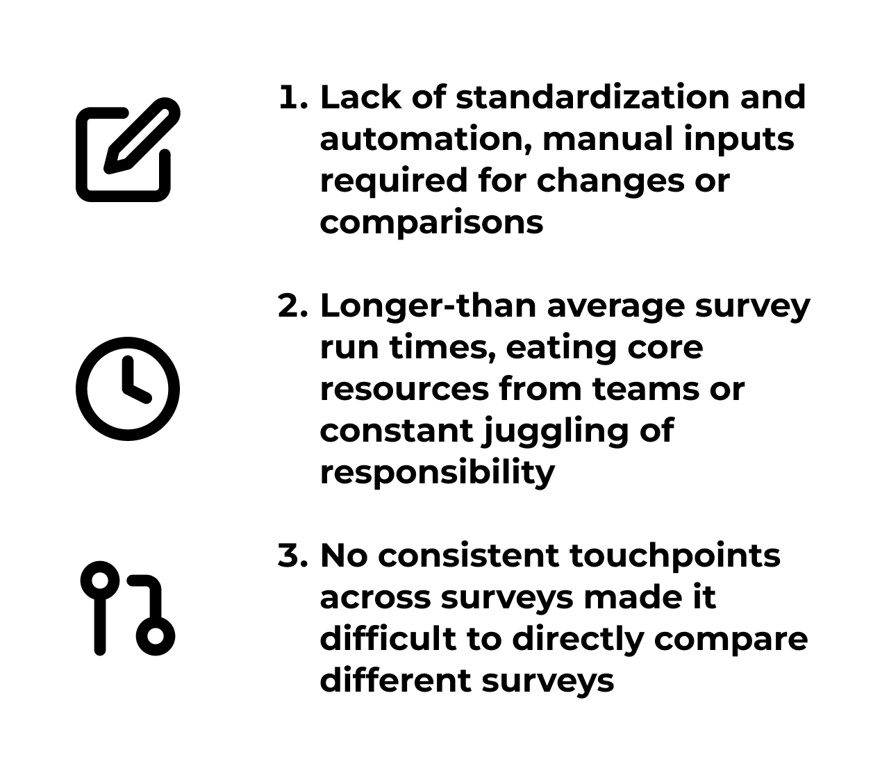
Now that ad hoc surveys were being distributed, we needed a way to monitor them. There was no standardized reporting on survey health, and we’d often find some surveys suffered from inconsistent issues including run-time or audience file generation. We identified 3 core issues.
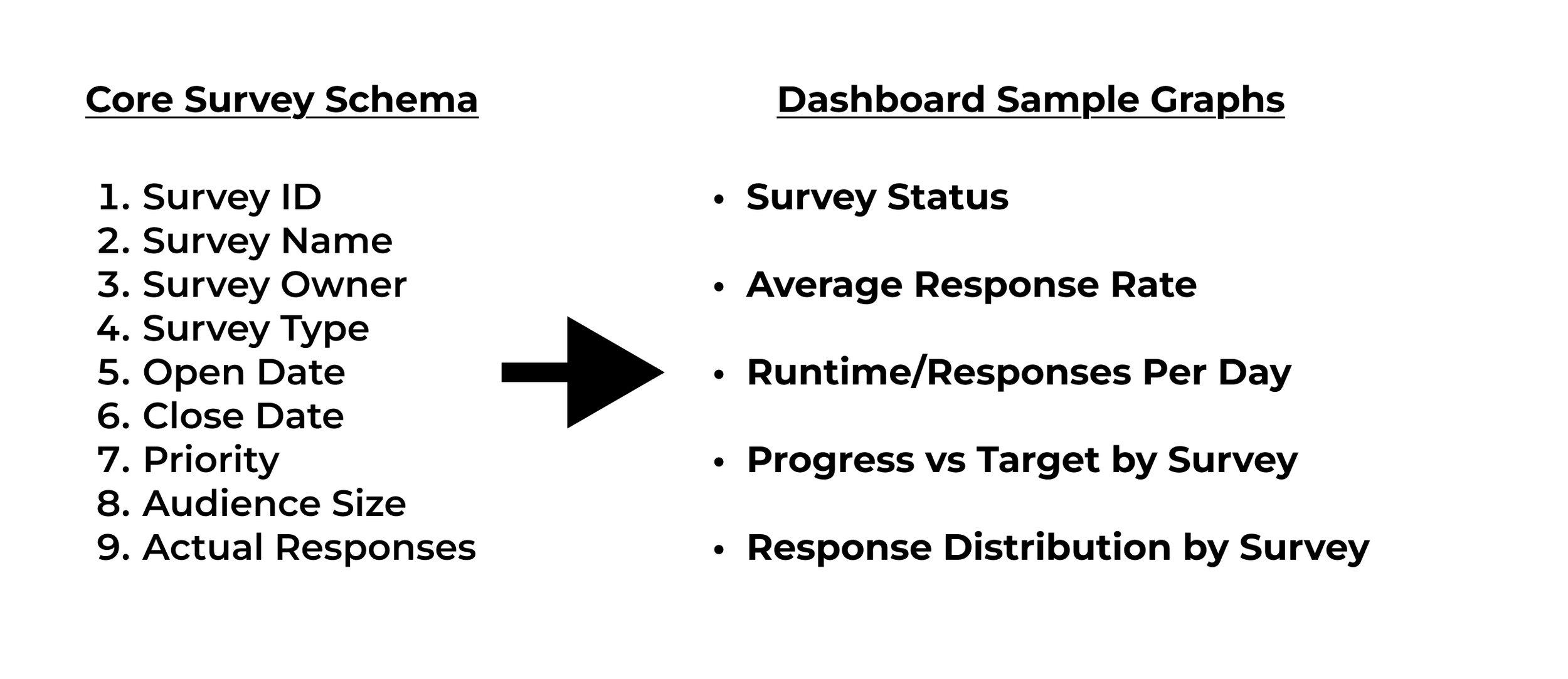
My first goals for this project were to get the Excel file formatted in a simple and readable form, and get a python script to run, compile, and actually read the file. I also decided to stick with a simple Python script and Excel input, I’ve worked with systems in the past and have found it easiest. Addressing core problem #1 directly, I realized that some manual input would be required, and simple data entry into an Excel file seemed adequate. Going back to the structure, I met with my manager to discuss, and we decided on 9 core fields to base our dashboard on, drawing results by connecting touchpoints across this schema.
First Script and Excel Schema
Script Development
Addressing the Python script, I relied on several extensions to help make the visualization easier. A big focus for me was cross-compatibility, or being able to transfer this program to others through email distribution or otherwise. So I chose selection extensions that gave me creative control with minimal end user inputs should I distribute the script instead of final results.
Tkinter: File Selection (easy transferability to any end user without relying on dependencies
Pandas: Processes and aggregates data
Dash: Interactive Visualization/Filtering
Plotly Express: Chart customizations
Base64/Datetime: Formatting scripts, time-series analytics

Code Snippet showing dependencies that checks and installs for any user
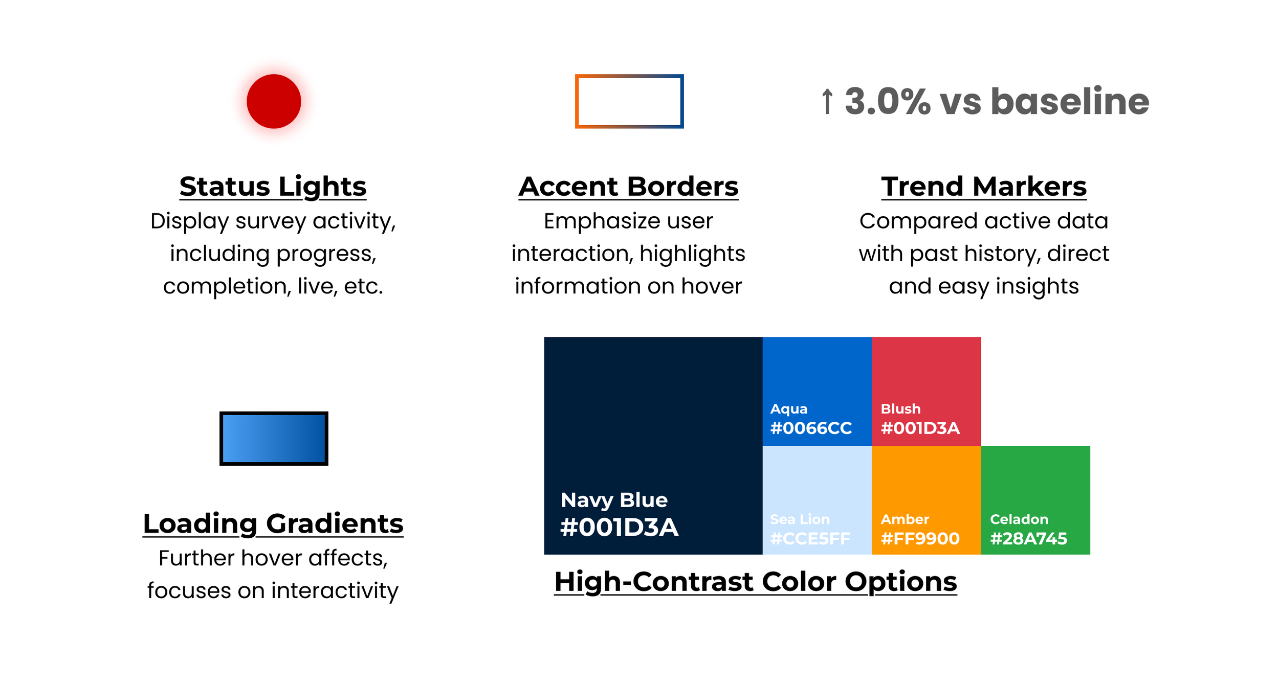
The final build has several functionality markers intended to maintain visual consistency and direct attention to areas of concern, with several outlined here.
Colored Status Lights
Accent Borders
Trend Markers
Arrows
Percentages
Loading Gradients
High-Contrast Color Options
Core Features: Visual Queues
Final Visualization
The completed dashboard presented a unified view with metric cards across the top (total surveys, live count, high-priority flagged surveys, average response rate), followed by chart sections organized by insight type—distribution analysis on the left, trend and performance analysis on the right, with consistent color coding and visual language throughout to reinforce the survey health narrative. Key features are listed below, focusing on accessibility and functionality.
Semantic Color System: Status/priority badges and charts use intentional color logic (red=urgent, green=success) for instant visual comprehension without text
Complementary Chart Pairing: Side-by-side progress metrics and completion rates enable direct comparison; type breakdown with labeled counts shows differences clearly
Progressive Disclosure via Hover: Detailed data appears on demand (e.g., "672 responses (95% of peak)") without cluttering the visual
Responsive Grid Layout: 3-column analytics grid adapts intelligently; consistent 65px margins prevent overlap and create premium feel
Conditional Data Formatting: Table rows/cells auto-style based on data state (live surveys highlight green, high priority turn red) making patterns obvious
Chart Type Mapping: Selection of chart types matches data semantics (horizontal bars for comparisons, line charts for trends, pie for distribution)
Tab-Based Content Organization: Overview vs. Analytics tabs reduce cognitive load while maintaining all functionality
Real-Time Responsive Feedback: Filters instantly update table and KPI counts, creating immediate action-response loop

Header Render

Cleaned Data Survey Render

Executive Overview Render

Survey Analytics Render