Netflix My Feed - From Keyword Searches to Intent-Based Exploration
Redesigning Netflix search as a purposeful, intent-based AI-powered search engine.
Project Overview
Netflix has a content problem. Not a lack of it, but a surplus. With over 270 million subscribers and thousands of titles across every genre, the platform's core discovery experience hasn't kept pace with its library. Users open Netflix knowing what they want to feel, but with no reliable way to communicate that to the product. The result is a familiar frustration: 20 minutes of scrolling, nothing chosen, app closed, and takeout already eaten.
My Feed is a concept feature that reimagines how Netflix users discover content. Accessible through a dedicated entry point in the navigation bar and embedded directly within search, My Feed lets users either describe what they want in natural language or navigate a hierarchical filter tree that progressively narrows from broad genre to specific subtype. The system visualizes how input is interpreted through a branching logic map, making the recommendation process transparent and giving users a sense of control over what they watch.
Project Outcomes and Impact
My Feed acts in unison with existing search logic to provide an optional, enhanced search experience that focuses on intent-based exploration as opposed to recommendations. This feature doesn’t serve as a recommendation tool as Netflix’s current algorithm works, but instead acts as a search index to find specific shows that the user searches for, whether by name or by genre.
Collaborators
Product Designer: Ralph C.
Timeline
Feb 2026 - Mar 2026
4 Weeks
Tools
Figma
A4 Paper
The Problems - Browsing Friction & Churn Probability
Business Context: Netflix’s engagement model depends on time-to-play — the faster a user finds something to watch, the less likely they are to churn. Internal research cited in public earnings calls has acknowledged that browsing friction is a measurable factor in subscription cancellations. The platform invests heavily in recommendation algorithms, yet the front-end experience for surfacing those recommendations hasn't meaningfully evolved.
User Context: Netflix's engagement model depends on time-to-play, where the faster a user finds something to watch, the less likely they are to churn. Internal research cited in Netflix’s earning calls has acknowledged that browsing friction is a measurable subscription cancellation factor, something that the platform heavily invests in via recommendation algorithms. Changes in search happen in the backend, but user-facing experiences haven’t meaningfully evolved at the same pace.
Real user sentiment collected from online forums reflects this consistently.
"I mostly use the search function now since the latest change in the user interface ... the boxes popping all over the place on the main page SUCKS !!!!! I click the back button then the left button then enter to enter the search area" - Mcozy333, Reddit
"It used to be better, I think Netflix has decided promote what it wants us to watch, rather than help us find what we want to watch." - crackeddryice, Reddit
"You can go to 12 different categories and the same movie at the top of the recommended” - _Raxy_, Reddit
Competitive Audit
Before designing, I reviewed how three competing platforms approach content discovery to identify gaps and opportunities.
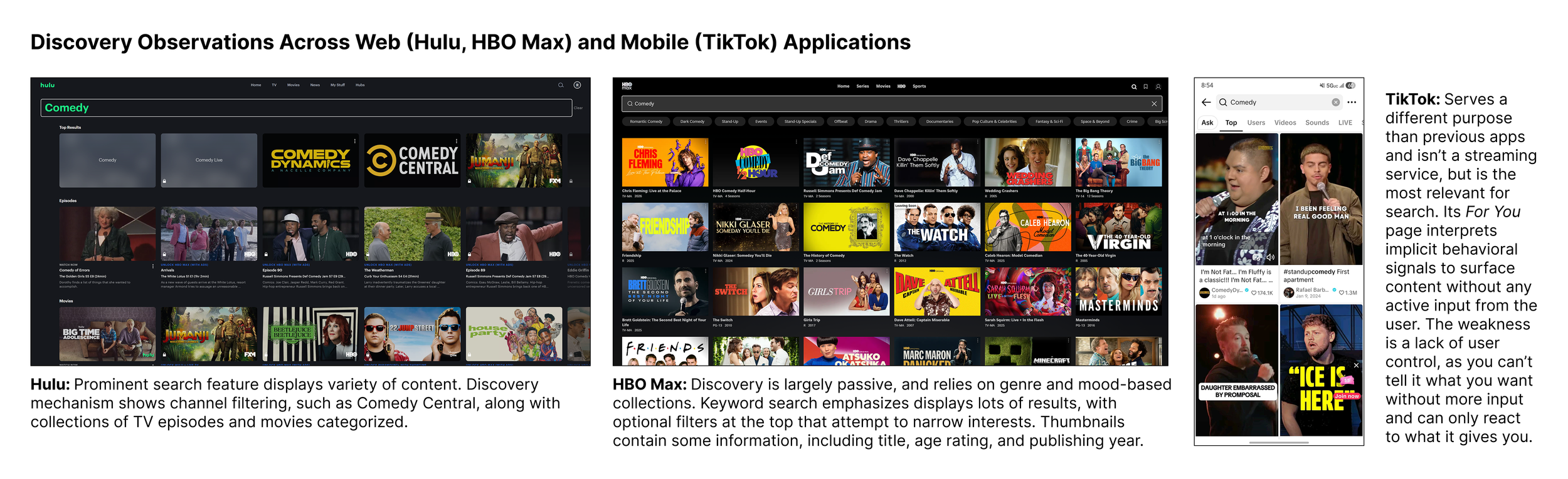
Hulu: Search is visually prominent and surfaces a variety of content types simultaneously. Discovery includes channel-based filtering such as Comedy Central, organizing results into categorized rows of episodes and movies. However filtering stops at the channel or genre level with no ability to express intent or mood beyond broad categories.
HBO Max: Discovery relies heavily on passive genre and mood-based collections, with keyword search returning large result sets and optional filters at the top to narrow by subgenre. Thumbnails include contextual information like title, age rating, and publishing year. This is an improvement over Netflix, but the experience still requires users to scan a wall of results with no intent-based input.
TikTok: Serves a fundamentally different purpose and is not a streaming service, but remains the most relevant benchmark for intent-based discovery. Its For You page interprets implicit behavioral signals to surface content without any active user input. The core weakness is a lack of user control; you cannot tell it what you want, only react to what it surfaces. My Feed takes the intelligence of this approach and adds the active control that TikTok lacks.
Design Goals: Three Principles
I chose 3 design principles to be the foundation of my design, emphasizing search functionality and how recommendations are pushed to the user.
Users consistently describe what they want to watch in terms of feeling and context rather than specific titles, and current keyword search doesn't accommodate this mental model.
When users can't explain why something was recommended, they're less likely to trust and engage with it. This creates a disconnect between the algorithm's accuracy and the user's perception of it.
Discovery friction compounds quickly, and every extra tap or scroll between opening the app and pressing play increases the likelihood a user closes Netflix without watching anything.
Design Conceptualization - Search Indexing
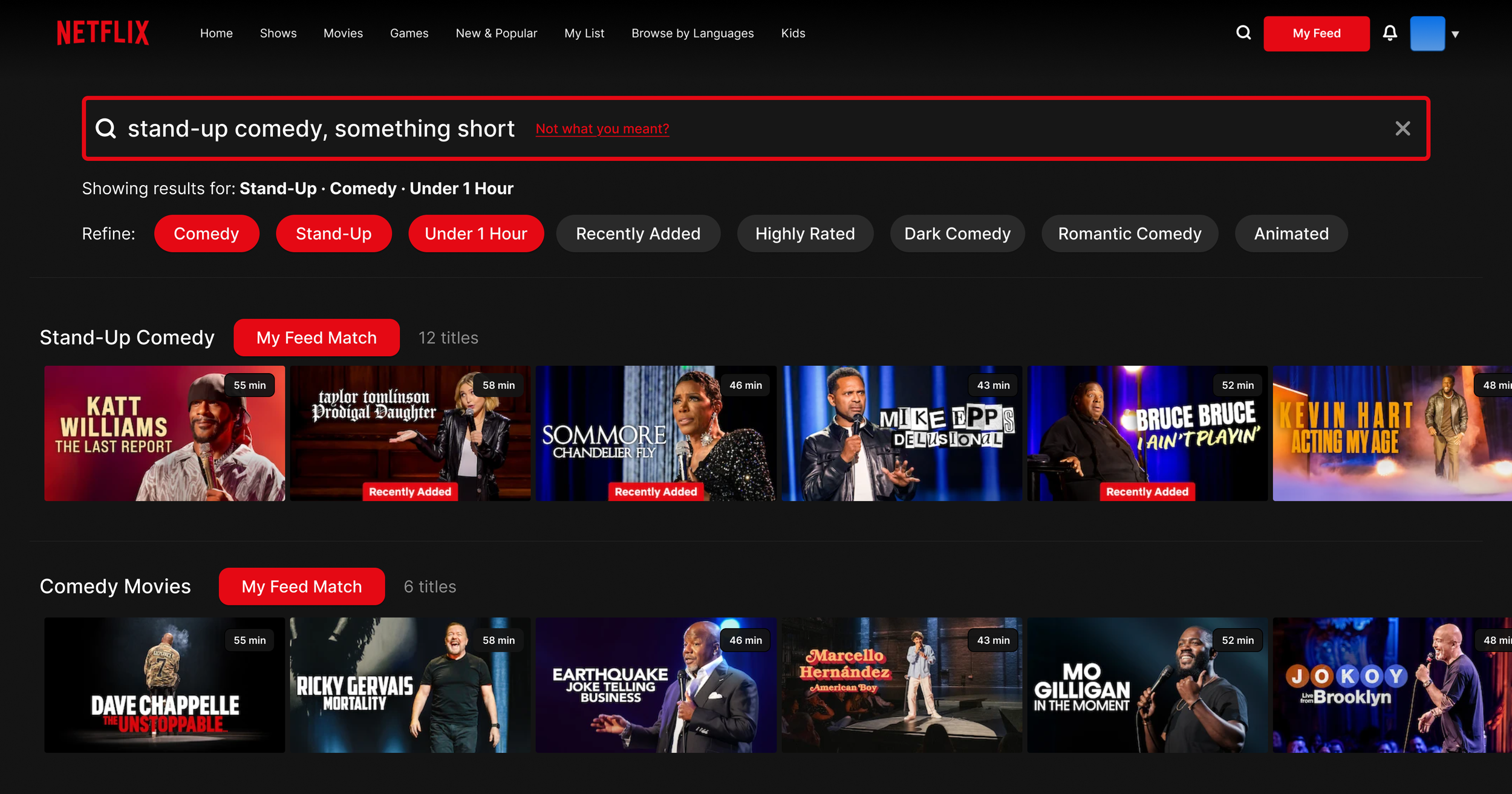
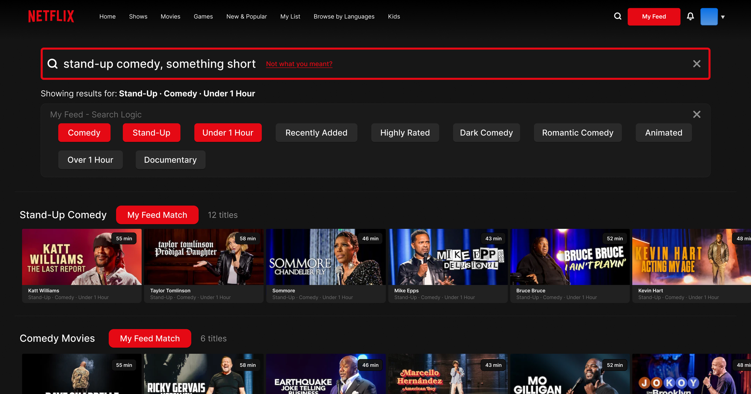
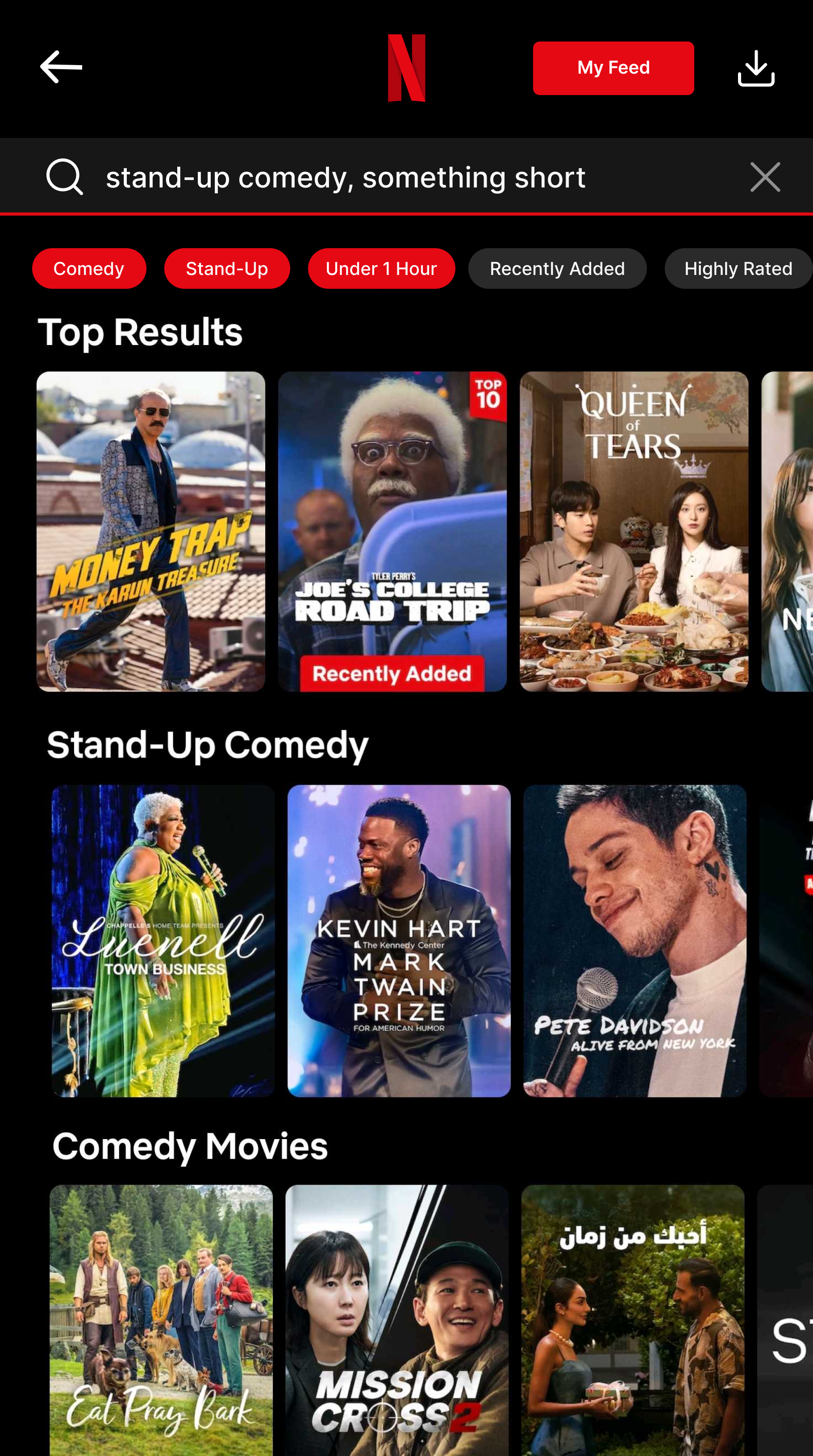
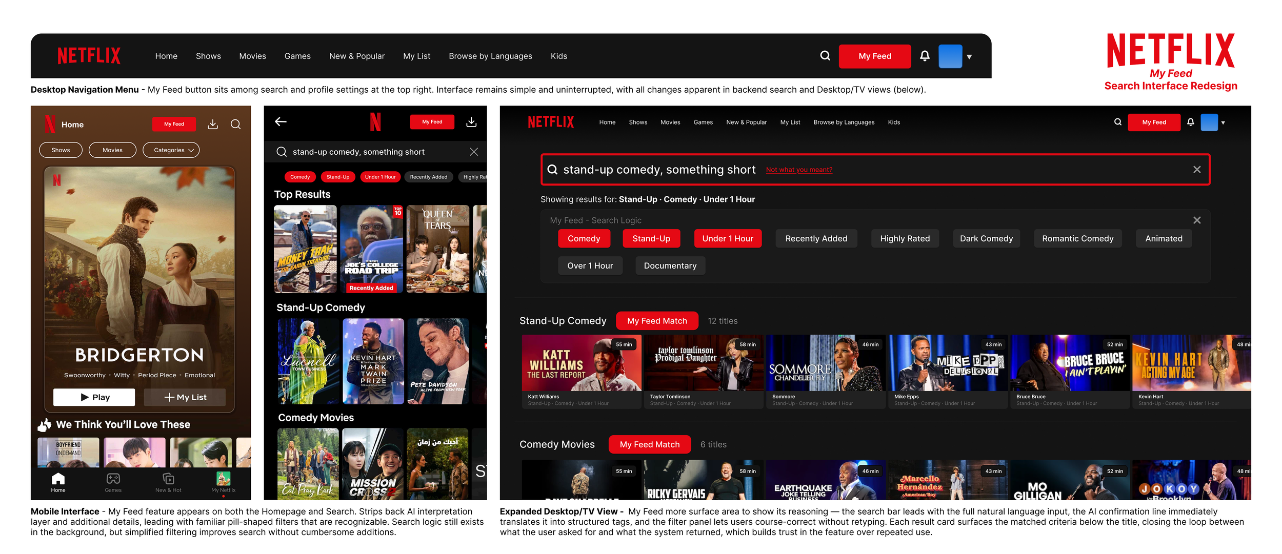
Thinking about how the user interacts with search is the core problem My Feed seeks to solve. Because this search acts as a compliment to traditional querying, I wanted to make it simple and intuitive in design and function. I eventually decided on a 5-stage logic flow, moving from a single tap on the search icon to a fully-filtered, curated results grid. The interface works with itself on the same page, reducing visual clutter and computing power. Each stage takes into account the user’s query, with the more information they provide yielding better results.
Design Visualization - Search Query & Indexing
The phrase I chose to emphasize in this project was “stand-up comedy, something short”. This phrase contains multiple tags in the query, such as genre, subgenre, and length. Subject, such as author or program title remains ambiguous to demonstrate someone who just wants to watch something funny, maybe after a long day of work or with a meal.
The new logic breaks the query, formatted as a string, into various keywords to determine the intent of the user. Standalone words don’t mean much, but the system analyzes each keyword and references each other to find a declared intent, ignoring unclear or ambiguous terms to arrive at a final filters list.
Experience Audit & Design Conceptualization
Early designs I did for the overhaul were done on simple paper and pencil, mainly some wireframe sketches and other pre-design considerations. I wanted to have a clear idea to how the search worked before sketching, and also tried to split up different parts, including considerations for both desktop and mobile. because mobile relies on touch, I imagined the feature would be slightly stripped down.
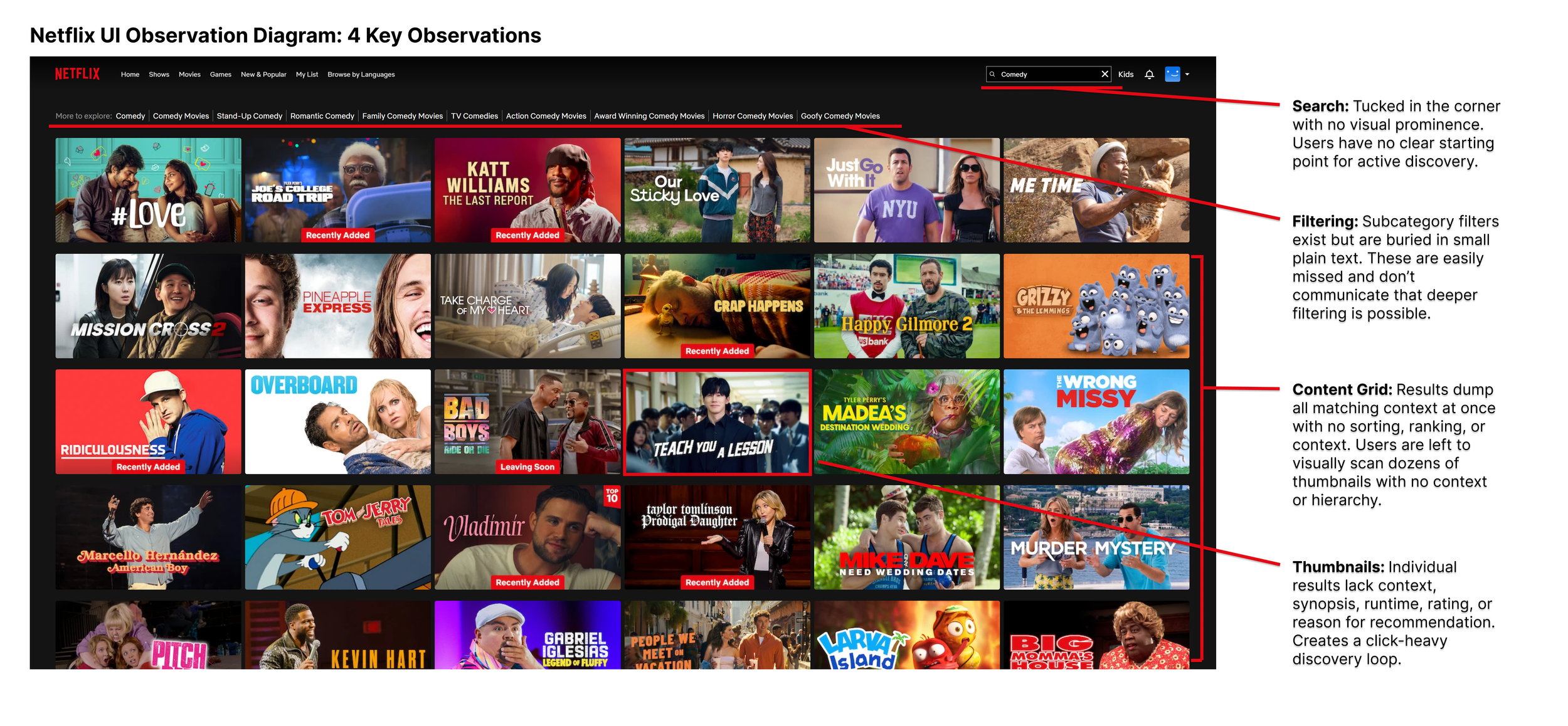
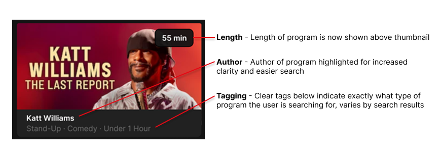
I also included some thumbnail sketches, as the current Netflix thumbnails didn’t do a great job at conveying key information to the viewer. Displaying a little bit more information is something I kept in mind, planning to include filters such as length of programming, the program title or author, and other tags.
Design Feature - Button
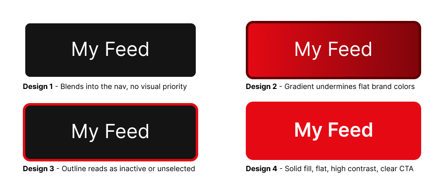
The button would be the core way users interact with the new search. Because this feature doesn’t replace the original search, its design should be simple, intuitive, and reference Netflix’s use of bold colors. I ultimately decided on Design #4 for its simple aesthetic, bold lettering, and avoidance of a gradient or borders, seen across competitors like YouTube.
Design Feature - Enhanced Thumbnails
Thumbnails also received an overhaul, primarily to give more information to the user without being obtrusive. It now displays watch time, genres, and other tags that can be filtered with My Feed.
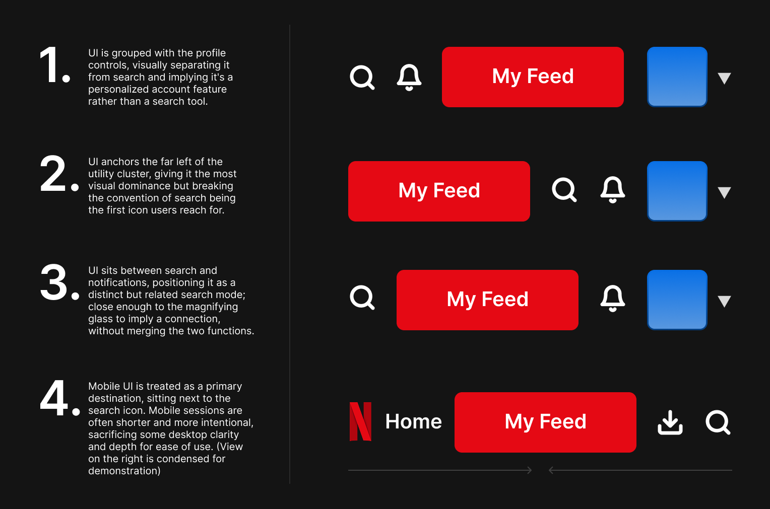
Design Feature - Navigation
Navigation placement was tested across four positions before landing on option 3. Grouping My Feed with profile controls framed it as a personalization feature rather than a search tool, and leading the utility cluster gave it visual dominance but broke the convention of search being the first thing users reach for. Placing it between the search icon and notifications correctly signals it as a distinct but related search mode.
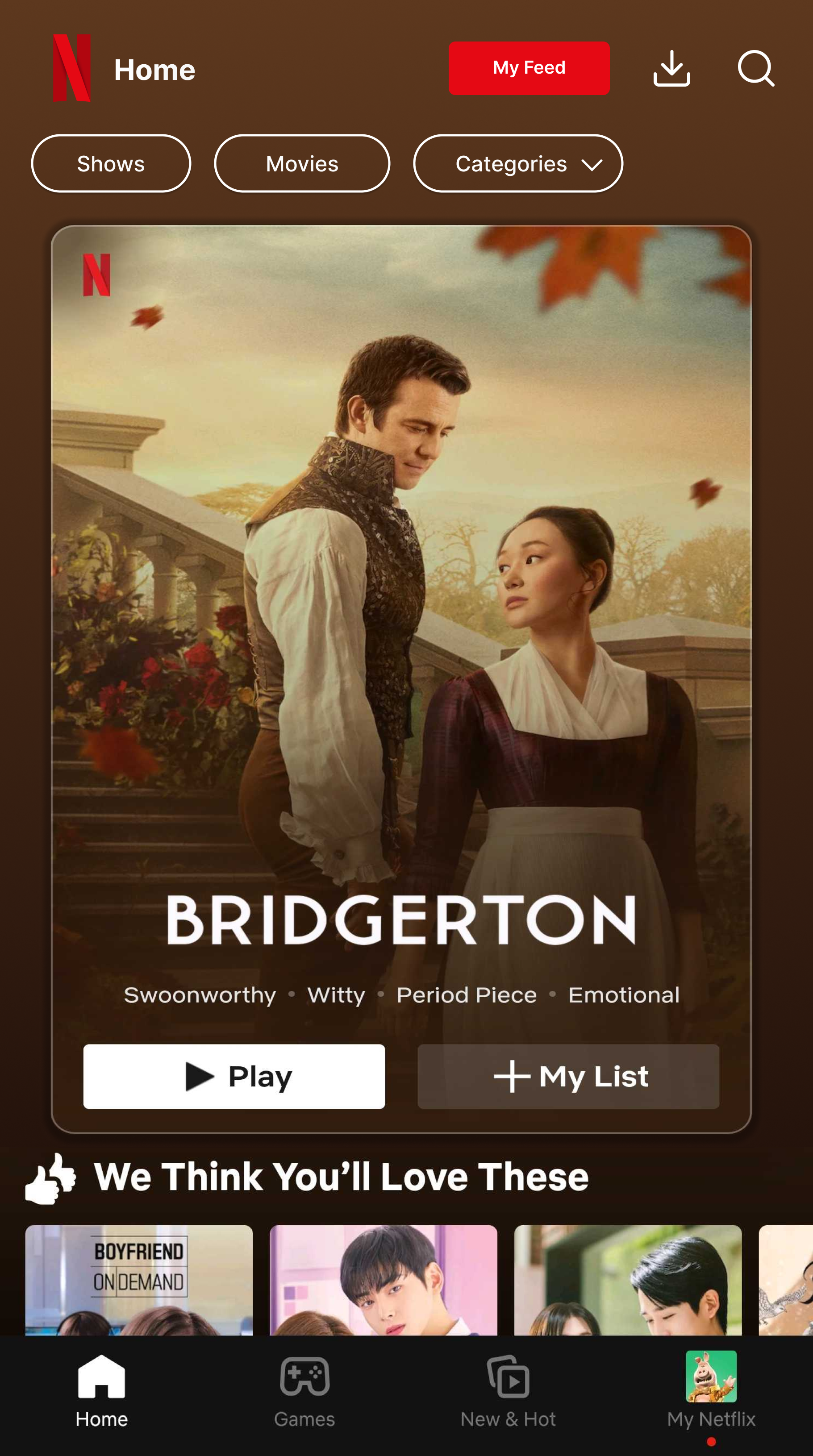
On mobile it moves into the bottom nav as a primary destination, trading desktop depth for the ease of use that shorter mobile sessions require.
Final Design
Measured Success & Takeaways
My Feed is a feature without live metrics, but I would measure success against 3 indicators. Reduction in time-to-play from feature entry, seeing how long users spend scrolling versus watching. Higher satisfaction scores around content discovery, aided by expanded thumbnail information and clear tagging. Lower bounce rates where users open the app and leave without watching.
This feature keeps regular search intact rather than replacing it, lowering product risk which is a significant positive when pitching a feature change to a platform with over 270 million active users.
This project allowed me to gain experience with proposing and developing a product feature for a software platform, utilizing current AI-powered technology to suggest a light change opposed to a complete overhaul. Early versions surfaced a full interpretation breakdown below the search bar, showing how the system detects user preferences, what it ignores, and how accurate the search feels to end users. Scaling down accessibility to mobile was also a fun challenge, having me really question which features are core and which can be safely stripped back without intruding on user experience.
To conclude, the next steps I would take would be to explore individualized feeds for every account under the Netflix household, then bridging profiles together to create a unified viewing experience, giving the feature a real competitive advantage worth shipping.