Mars Wrigley - Unifying a Brand Experience System for UNLV’s Rebel Express Student Store
Crafting cohesive, human-centered design touchpoints to engage customers through the Mars Wrigley unattended retail experience.
Project Overview
The need for cohesive communication between even more important when designing for a store with no employees or staff. Unattended retail, powered by AWS Just-Walk-Out (JWO) tech, crafting a student store to service 33,000+ students and faculty at UNLV requires a delicate balance of creative visualization and intuitive human-centered design. My role was to design visual concepts that account for geospatial proximity to the store, including directional signage, informational dialogue, and creating conversion points to draw attention to the store and reduce student hesitancy when faced with new, unfamiliar technology.
This project was completed during my final year as an undergrad at UNLV, under the supervision of UNLV marketing professor Brandie Feuer and Mike Iarkowski, Mars’ BDM, Digital Commerce & Unattended Retail.
Project Outcomes and Impact
The unified visual system increased sales by creating emotional connection and clear product discovery. The use of Mars’ characters and branding increased adoption rates with 25% more sales observed during peak hours, and saw foot traffic increase by up to 70% during exam season. The work demonstrates how important visual storytelling is, especially in a physical retail setting. Directional signage mixed with semi-vague messaging creates interest, while direct signage outside of the store directly explains the checkout process to customers, reducing hesitancy and adopting payment systems already-existing in the university. Finally, the concepts visualized in this project brought important conversation for Mars, specifically around using empty space around vending machines to offer a direct competitive alternative for customers to consider before their purchase.
View the media article here: https://www.unlv.edu/news/article/tech-evolution-meets-student-innovation
Collaborators
Dev/Designer: Ralph C.
UNLV: Brandie F.
MARS: Mike I.
Timeline
Jan 2024 - May 2024
Tools
Figma
Adobe Photoshop
Looker Studio
Initial Challenges
Unattended retail stores intrinsically lack that the human element that guides customer navigation and brand engagement. Without staff to highlight products or respond to questions, the entire customer journey depends on visual design to communicate product value, brand personality, and purchasing motivation. Besides these principles, the original store suffered from a few issues:
Proximity to competitors: Rebel Express is located directly next to POD, a comparable student store with employees, though not as much product selection
Limited geographic knowledge: students surveyed, and even employees at the help desk were unaware of the stores’ existence or even the name of it
Technology adoption: due to a lack of employees and the use of financial services, students and staff may be hesitant to trust new technology
Customer Journey & Store Experience Mapping
To better understand where visual design would stand, I mapped the complete unattended retail journey. A student seeking a snack in the student union encounters multiple touchpoints that can serve as discovery moments. Without visual hierarchy guiding this journey, students make decisions on impulse, choosing familiarity even if it’s less convenient. The challenge was creating a unified system that felt intentional at every touchpoint.
I created a 6-touchpoint system that tracks engagement and core focus areas in my redesign, from the exterior of the building to the interior of the store.
Storefront Observations
I also took the liberty to observe foot traffic across the store itself. I stood outside of the store for 45 minutes and made several observations
86 students walked by the store and demonstrated awareness (reading signage or glancing inside
Only 6 of those 86 entered and made a purchase, 2 made a purchase while their friends/peers waited outside
7% conversion rate was observed from awareness to purchase, showing a friction point from interest and action
Reluctance to enter by peers suggest uncertainty or social friction, especially if a financial aspect is involved in the decision
Design Research & Visual System Analysis
Through the customer journey and physical site observations, I finalized my research by taking the categories above and implementing strategy at how to tackle issues associated with each step.
Campus Visibility & Wayfinding: Bold color blocking with character imagery created strongest visibility, while character-driven messaging (Always Open) made the concept approachable
Entrance & First Impression: M&M characters paired with operational messaging (Scan N' Go) reduced friction by setting clear expectations upfront
Interior Navigation: Consistent visual language across touchpoints enabled intuitive navigation without staff guidance
Product Engagement: Characters created psychological comfort and communicated brand personality without human interaction
Digital Extension: QR codes bridged physical and digital experiences while maintaining brand consistency
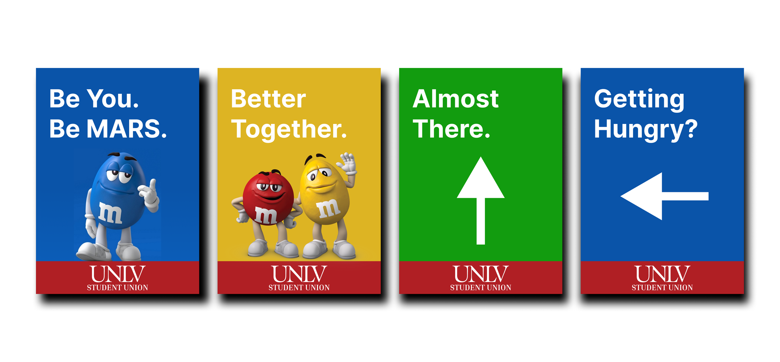
These observations gave me an idea as to what types of designs to make, whether they were directional posters or sidewalk decals. As I started designing, I ensured there was a good balance between interior and exterior concepts.
Visual System & Geospatial Design Direction
The redesign created a unified visual language across all 5 touchpoints using consistent color hierarchy, typography, and spatial principles that reflected Mars brand while guiding customers through the store. Each touchpoint was designed to work independently while contributing to an overall brand narrative that communicated product benefits and created emotional connection. The system directly addressed conversion barriers by establishing trust at entrance, providing clear navigation, and using character-driven messaging to create comfort in the unattended environment.
Below are the first designs I created for the project, combining familiar UNLV branding to reinforce location while subtly introducing Mars characters and directional signage to create intrigue. This plants an expectation of a physical experience for students, and gives them clear directions at where to go or what to expect.
Design System & Component Library
Establishing a visual foundation continued in the development of other types of signs, including banner ads similar to the ones found above. I noted a few design considerations throughout my process, and turned my designs to exterior-facing concept art.
Color Palette & Typography: Defined specific Mars color values and typeface usage to maintain readability across interior and exterior applications without compromising brand identity
Character Integration: Established positioning, sizing, and usage rules for M&M personalities to ensure consistency whether appearing on collateral or environmental signage
Layout Grid & Spacing: Built a modular grid system that accommodated varying content lengths while maintaining visual rhythm across all applications from digital to environmental design
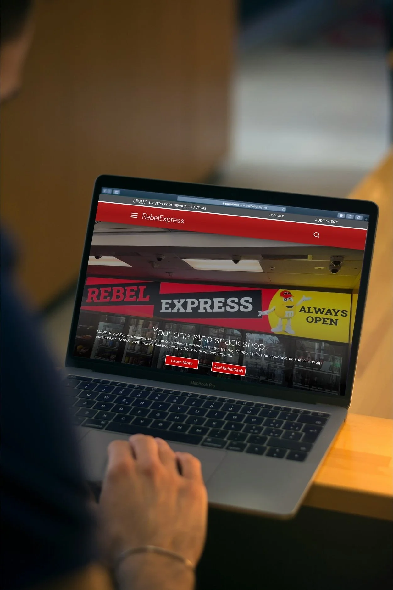
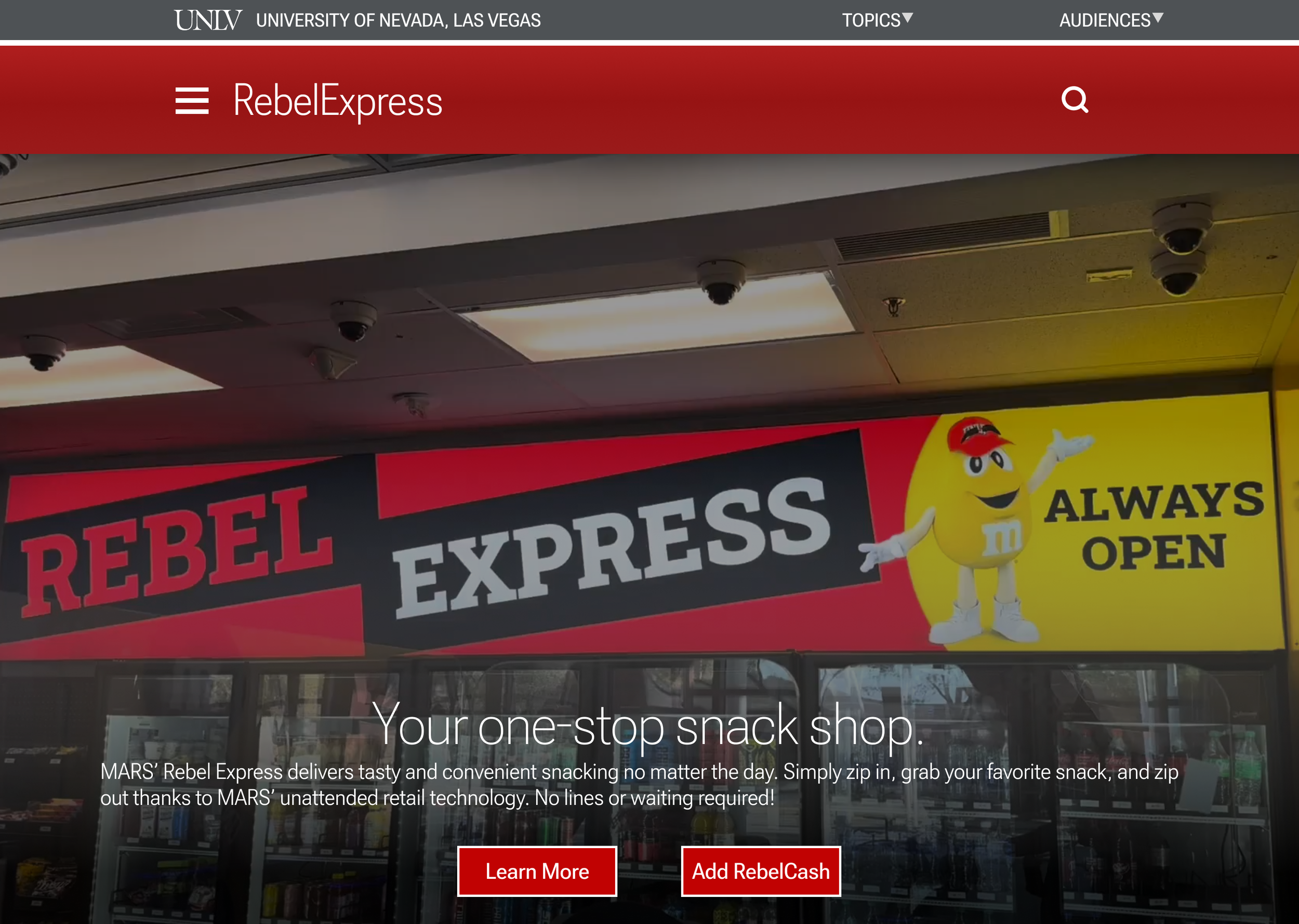
A Digital Compliment
Even though my focus was largely on the physical space, I couldn’t forget the oftentimes larger and more impactful medium. Since digital is how we now interact with the world around us, i also took the liberty to create digital experiences that better align with the Mars branding, including a page on the student union website. I also created some fun business cards that mimicked the design of Mars’ iconic candy bars, all equipped with QR codes to access this site and information on the stores’ location in the student union.
Project Finale
The finale of this project culminated in a presentation to Mars executives and UNLV professors. The presentation I gave was focused on UX across both physical and digital mediums, emphasizing taking advantage of every touchpoint as a meaningful outreach opportunity.
Final design concepts are below, including expanded designs for signage and other graphic design pieces.
Me presenting the concepts to our MKT 380 class and Mars executives. Apologies for the potato quality!